Mmm…

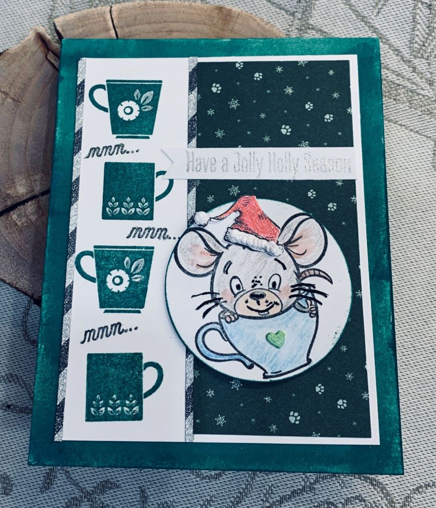
With green being the predominant colour choice on various challenges, I decided to try to make one card that would fit several and this is what I came up with. As well one challenge is a sketch and it fits that one too.

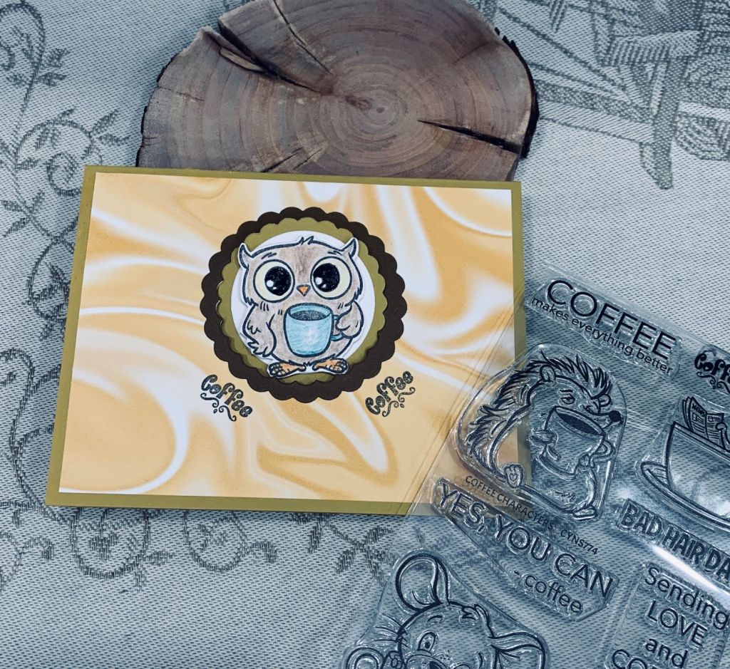
Stamp sets used are an old coffee set from GKD, a new set from Your Next Stamp, an old one from Tim Holtz and the sentiment is from MFT and is another fairly new set for me. These images from YNS are quite cute and this is the second one I’ve used from the set. I did add the Santa hat which I coloured with a red glitter pen and added some fluffy stuff from Cosmic Shimmer. As well I added a tiny heart to the coffee cup and coloured it green. The image has been done with various pencils and an Ohuhu alcohol ink pen. There is also some sparkle added here and there. The sentiment was heat embossed in silver.

I started with the white panel to which I added the line of coffee cups in Pine Needles Distress Ink. In between the cups I added the mmm… then I added the sparkly striped thin strips to separate them from the dark green PP. This is a scrap piece from an old 6X6 pad. I stamped the image onto the circle which was a left over from another project and edged the circle with the same green ink. This was popped up on foam tape. Before I added the panel to the card front I used the same ink and brushed a section with the colour so it would match the cups. I debated adding some additional embellishments and decided against it. I can always change my mind when the time comes to use the card.

These are the challenge links where I am entering the card:

https://colorfuloptions.blogspot.com/
http://just-add-ink.blogspot.com/

I hope you are all having a happy day. We finally got my car out of the garage so I can use it again. Poor hubby is exhausted from all the snow clearing.

Cheers

There seems to be a few challenges out there that are asking for green in some way. You would think I could come up with a design that would work for them all, but I must be tired as I couldn’t think of anything that would work. For now I’ve chosen to do this one as my entry into the Color Hues challenge which requires green and gold. If I come up with other ideas I can add another entry.

While out today, I discovered a new craft store that I hadn’t been aware of and as I needed a re-inker I went inside. Of course one item is never the result and I found this Lemon Twist stencil from Simple Stories. Lemon and limes are so similar that I made mine into lime slices to fit the challenge. I edged the panel with gold heat embossing and stamped the sentiments, from a Joy Clair set, in gold as well. I had some patterned green vellum so added that over the card front and then a strip from a very old pad that I’ve had forever. After which I added the focal panel. A few embellishments from my stash and it was complete. It turned out better than I expected and I think will make a nice masculine birthday card when I need one.

We’ve had almost 18″ of snow in some areas of our property and it is so heavy and packed that we can’t get my car out of the garage. In fact a neighbor came yesterday and dug a parking space at the top of the driveway and a section all the way down to the entrance using his tractor. He then kindly went with my hubby to the mailboxes, which is where hubby had to leave the van when it wouldn’t get up the hill. He dug it out and ensured my hubby could get up the hill so we at least have one vehicle functioning. Our neighbor may come back tomorrow to help us dig out the rest, but he didn’t have time to do it all yesterday as he went along the crescent and dug out other neighbors before going to work. Even though we purchased a small quad with a plow, the weight of this lot is too much for a small machine. More snow is predicted. I am so done with winter.

Thanks for stopping by. I am grateful for all of you.

Pinks, Pearls and a flower

When I saw this challenge yesterday, I started to think about what I might do to participate. There were several ideas in my head, but none of them truly grabbed me. Then this morning I saw our stamp buddy, Angie’s post, and a light bulb went off in my head. So here is my take on both the challenge and her card.

I started with some watercolour CS which I embossed using a SSS folder. Taking one of those (old) distress wheels, I distressed the edges and added some pink to the edges, heavier along those, and lightly to the raised sections. Then I cut a black piece and distressed that too. Glued them together and while they were drying I looked through my dies to find a flower I thought would look nice and chose a Memory Box die called layered daisies. I had a small inked background piece left from a while back and it was mostly pinks so I die cut the flower using this. As it was a thin paper it needed a bit of support so I cut it again from black CS and layered as you see. The stem of the flower is made from Mizuhiki cord (from Japan) and the leaves are die cut from DSP using a very old die that I have no information on. The word is from a Hampton Art sentiment set and I stamped it twice. Glued the 2 pieces together and then cut around the letters. Because it is only an outline I had the bright idea of filling it with small pearls from my stash. Added a few more pearls, glued it to the card front and called it finished.

My hubby really liked it and I have to say I’m quite pleased with it myself. Thanks for taking a peek, it is appreciated that you share your time with me.

Pop Up coffee card

Card Front
Inside showing pop up

Anything Goes with a Fun Fold for Creative Creases #51

I saw a version of this kind of pop up on Pinterest and I thought that I had to try one for myself. The post calls the design a Bijou Pop & Flip Card and you can find the tutorial HERE.

Funnily enough, my local coffee shop had the words I’ve included on the inside on a small plaque and I got permission to use them. I found the saying amusing and in a way this is another reason the card was made. I did this on the computer and printed it onto CS.

Basically I followed the tutorial so I won’t go into the ‘how to’ here. Suffice to say that I adapted a couple of things because I used a smaller circle so the inside pieces needed to be a bit smaller. I learned that using a scalloped edge is probably not the best idea as they stick a bit when opening it. Next time I will use a straight edge circle or oval. There will be a next time as I like the result a lot and it is a cute way to make a card. My stamps are from a new set called Coffee Characters and came with dies, purchased from Your Next Stamp here in Canada. (Thank you Lisa K. for the link). I stamped, coloured with various pencils and Sakura Glaze pens, then die cut the image. The paper is from StampinUp and I really like these marbled papers a lot. The other small change I made was adding a frame around the edge of the die cut as I didn’t like the impression the die had made during the cutting process.

This is my first entry into the Creative Creases challenge and it is fun to participate in a new to me challenge. Thanks for stopping by.

Water Your Roots ….

For this card I used a Catherine Pooler set called Koi Pond. It is still fairly new to me and I thought it would be good for a colouring session. I stamped the fish first then masked it off so I could add some colour around it and I also stamped the ripples at the same time. Ink colours used are Distress Oxides Cracked Pistachio and Twisted Citron. I liked this sentiment and used it as you see and added the bubbles as well. I added Nuvo Crystal drops to the bubbles and while they were drying I carefully coloured in my fish. I used Inktense pencils to do this and I added a tiny bit of sparkle along the fin and tail rib lines as well as to the fin along his back. I forgot that this stamp set has a tiny dragonfly stamp so have made a mental note to myself to remember it for another specific challenge I often enter.

Our predicted snow didn’t arrive until late this afternoon, so we’ll see how much arrives when we get up tomorrow morning. I’m happy with how this card turned out and it was fun to do. Your visits to my blog make me happy and I wish you all a Happy Sunday. Hopefully you are staying warm and don’t have to deal with a ton of snow.

You’re so Kind

http://cardz4galz.blogspot.com / challenge #193

The new challenge for February at http://cardz4galz.blogspot.com/ is to use red, white and pink. I decided to use butterflies and a technique found here by Natasha Foot that she calls double masking. I used an old stamp from CTMH and a sentiment stamp from an incentive set by GKD. Although I chose a butterfly stamp, mine is quite different from the one that Natasha used and I coloured mine initially with Prisma pencils and blended with an alcohol blender. I used two tones of red and two of pink and to jazz it all up I added some shimmery watercolour in Garnet and Chiffon Pink by ColorArte to sections of the wings on the upper and lower images and white perfect pearls on the middle one. The shimmer is quite apparent in reality, but isn’t great on the photo and on the bottom image the red looks a bit orange, but is definitely red. I added a few pink embellishments from my stash. I also used a foam pad to give some dimension to the layer.

We hope you will join us and participate in the challenge. Many thanks for stopping by.

Lots of Caffeine

Caffeinated Christmas Card Challenge #14 – Hearts

This stamp set is from Joy Clair and I’ve only used it a few times. I thought it was time to pull it out and use it again. The penguin is from the Cats Pajamas and the sentiment is computer generated. PP is from StampinUp and I used a Heffy Doodle heart border die along one edge.

Once I had stamped the image in black, I stamped it again in Versamark so I could heat emboss in clear. Then I used Distress Oxides and basically water coloured each cup until I was happy with it. I cut the panel down and then die cut the border before adhering it to the PP and then to the card front. As I didn’t have an appropriate sentiment stamp I made my own and added the penguin as decoration. I used Sakura glaze pens to colour the penguin. I don’t make many slimline cards in general but this stamp is perfect for that style of card.

Thanks for stopping by and have a great day everyone.

Circles and Dots

A while back I saw a picture that really intrigued me, so I saved it in case I could make something similar. This morning I came across the picture and realized that if I could create it, it may work for two challenges and this is my version.

After cutting the CS to a 5″ by 5″ piece, I made a mask for the larger circle. Before adding the mask I went over the panel lightly in Spun Sugar giving the whole thing a hint of pink. Then I added the mask and inked with Shaded Lilace and Shabby shutters. Before removing the mask I stamped the village house using a new stamp set from MFT called Seasons Greetings. I also stamped the sentiment from the same set. Then using 2 different handmade stencils (made by friends) I stamped 3 more circles using the same inks and each time adding an image before moving the mask. Those stamps come from older GKD sets. Then taking the graduated polka dot stencil added more circles in various places and different sizes. I wanted it to have some shine so I took some Perfect Pearl powder and went over the entire piece. I added foam tape to the back and adhered it to a 5 and one quarter inch card base.

I have surprised myself with how this card turned out as I was truly experimenting and playing with ideas as I went along. I like that this is so different from anything I’ve ever done in the past and getting it to work for 2 challenges is a bonus. I hope you like it and thanks for taking a look.

A Little Birdie …

The box card I posted yesterday that was made for my sister, was in a way inspired by this one. I started this Z-fold with a friend’s birthday in mind and as he owns and loves horses I used the old rubber stamp of the horse. I added him to the frame background which was stamped using an old GKD set and I water coloured the sky and ground. DSP is from StampinUp, the fence and gate are MFT. I swiped an ink pad over these to give the wood look. The other stamps are from Lavinia and GKD respectively.

When I began the card I knew I wanted a Z-fold, but it took me 2 tries because I had already stamped the focal image and background and it didn’t seem to fit how I imagined it. I ended up cutting off the back portion of the card and adding a new section so I wouldn’t waste too much card stock. Then when I finally had it right with the Z-fold part also added, I realized the centre section looked empty, I decided to make that section into a box. After several attempts I was about ready to give up when I found a tutorial that looked like it would work without me having to take the card apart. As you can see it worked, but in the attempt I realized that I had better make another box card to try to fix the ‘how to’ into my memory. Hence my sisters card was born.

At the time of creating this, which took me over a week, I hadn’t intended it for a challenge and I hadn’t posted it either. This morning I thought maybe I would post it and in checking a few challenge blogs realized it would work for the Make my Monday challenge. And I’ve added it to the Creative Creases challenge as per Debbie’s suggestion. Thanks for stopping by and I hope your day is going well.

A Circle of Love

I had all these circles on my desk from playing around on a different project. I never throw them away as I know I will use them for something at some point. Then I saw the AAA challenge and hey presto, I’ve used some of them for the challenge.

My circles are cut using Infinity Dies from Hero Arts and I had several frames sitting around in both white and gold. The blue dots were fall outs from a card I did the other day and the scripty love heart is an unbranded die that I quite like. I cut 2 used one as you see with the word and one I just cut the heart for the solid circle. The frames were glued flat except for the gold one which I carefully added foam tape on the back so it would pop up slightly. The solid gold circle sits almost popped up because it is resting on the frame.

When I first began the card, I wasn’t sure where I was going with it, but when playing with the shapes it all sort of flowed together and I’m pleased with the end result. It is CAS and has an elegant feel to it too.

We have family day holiday tomorrow and I am hoping the weather is nice so people can get out and about easily. Thanks for taking a peek.