“Raindrops are Falling on my Head”

Things that FALL

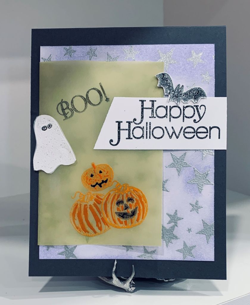
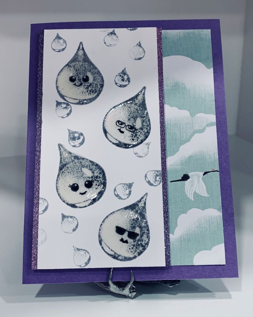
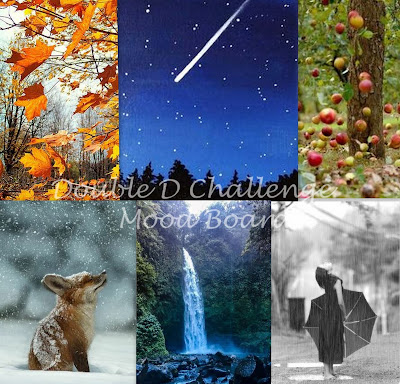
When I saw this mood board a couple of weeks ago, my mind kept returning to it wondering what I might do for the challenge. When talking to my housekeeper the other day I commented on rain and it was like a lightbulb went off in my head. Then I had to figure out how to make the idea work so another day went by. I knew I had a stamp set, several actually, by Designs by Ryn, and I also knew I had a new uninked stamp set from MayMay Made It and was wondering how I could put the 2 together. Yesterday I saw some raindrop emoticons that made me smile and I suddenly knew exactly how to use both stamp sets. This card is the result. I wanted something that would be fun, and very different and I think I’ve achieved it. I did make a few practice pieces to ensure I could stamp properly and not lose detail. I began with the faces, added some Sakura glaze so they would stand out once the rest was added and then I carefully stamped each large raindrop over the faces using Hickory Smoke ink and clear heat embossing. I did each one individually and once heat set and cool I added Nuvo Chrystal drops on top and left the panel to dry. I’m impatient so to prevent myself from ruining them I took the dog for a walk. When dry I added some smaller rain drops around the larger ones. Should have done this before adding the Nuvo drops but I made it work and although they are not as defined in a couple of places it doesn’t matter as real water isn’t defined either. It took me a few minutes to decide how to add it to a card front and in the end I decided to add 2 glitter side strips and then foam tape to make it stand out. Choosing the DSP was another thing and the paper I thought would work I had finished so I went through everything until I found this one. I kept it small enough to allow a larger border showing and then added the main panel to it. I have decided to leave the sentiment for the time being as I’m not sure about it, but I’m really happy with the result as I made the idea that was in my head come to life. Hubby likes it a lot and I hope you do too. Thanks for looking.

BOO!

SSC292 SKETCH TIME!

As most of my friends know, I’m not a big Halloween fan and don’t make many of this type of card. Occasionally I will do one for a child and this is such an occasion. The stamp set used is from GKD and is an older set. I stamped the pumpkin onto some yellow vellum using Carved Pumpkin ink and then heat set using clear embossing powder. The little ghost was stamped onto a scrap piece of normal vellum with white dye ink and then heat set as well. He was fussy cut and then glued near the word Boo. The vellum was scored at one side and then adhered on that fold at the back of the other layer but before I added it I stamped the stars in Versamark and heat set them in silver. Using a sponge I added some Shaded lilac ink to give some colour for the stars. I stamped, heat set and fussy cut the little bat and added him on top of the main sentiment. These 2 layers were added to a dark gray card front. I think this works for the sketch so is entering into the Sunday Stamps challenge. Thanks for looking.

I Dig You

Just Us Girls Challenge #650 – Color Week

As I was working with 2 of these colours yesterday, I decided that adding a 3rd would be easy and this card was the result. When I initially began the card the only thing I knew for sure was that I would be using this MFT stamp set and dies, (called You Gnome Me) but had no specific plan in my head. I began with the card base which is not quite brown and not quite orange but a muted version of both and the white panel. Before actually stamping anything I laid the stamps on the white piece to see what they might look like and decided that they would need some grounding so I added the thin brown strips using my T-ruler to keep them even and straight. Then I stamped the images on a scrap piece, coloured them using Inktense pencils and some Sakura glaze and then die cut them. I added foam tape on both pieces but a little thicker version on the boot image and placed them on the strips as you see. I stamped the sentiment at the top and added a smaller brown strip underneath it. I also went over the sentiment with a glitter pen. Then I stamped the tiny snails, coloured and die cut them and added them at the bottom of the piece. The grassy layer behind the image panel is some packaging that I kept and I decided to add some of it here for a background to the rest. This card works as a masculine card and as I have several masculine birthdays coming up, one of them will receive it. Thanks for looking.

Hello Friend

Color Hues #49 Yellow and Brown

When making the earlier card for this challenge, another idea popped into my head so I decided to do a 2nd card. This one uses a sentiment stamp from GKD and a leafy swirl stamp from CTMH which is very old and likely discontinued. Taking a small white panel I stamped the leaf along the edge in Gathered Twigs and the sentiment lower down and to the left using Ground Expresso. Then I die cut the flowers in 2 different yellows and added them together. Die is from Memory Box and is called Layered Impatiens. I only used the smaller layers for this card but I now have some larger flowers ready for a future card because of the way this die cuts. Once I had them placed the way I wanted I glued them down and added a few single flowers using the smallest section of the die. To finish the panel I added some Trinity Stamps embellishments in gold. I took the same bright yellow paper and cut a panel to be offset behind the main layer and added it to the brown card front then I added the image layer at a slightly different angle. Its a simple card but quite effective and I’m pleased with it and I have a few friends who will appreciate a little note like this. Have a great day everyone.

Squared Away

Color Hues #49 Yellow and Brown

I’m not a big fan of brown as a design colour, but it is nice with yellow so I decided to make a card for the current ColorHues challenge. I had made a stencil using a die quite some time ago and thought it would be nice as the base for the rest of this card. I sponged through the stencil with yellow to get the background and then using another stencil I added a bit of texture in brown. Colours used are Distress Inks Mustard Seed and Gathered Twigs with Ground Expresso for the actual images. Stamp sets are from various GKD sets. Except for one stamp they are all silhouette images and I debated whether to colour the one that isn’t, but decided to leave it as is. I did add some tiny pops of colour to the flower centers but they are not as visible in the photo as in reality. I backed this layer to some bright yellow paper and in turn added it to the brown card base. Then I added the gems which are an almost orange yellow so that the card has some sparkle. At first I wasn’t sure if I liked it but as happens many times, leaving it overnight and then taking another look has helped me to see it properly and I quite like how it turned out. Hope you are enjoying the weekend. We have a sunny day with some wind so it is fall like but nice.

Sympathy

Game #223: NO Layers + Sympathy card

Sympathy cards are the hardest to create and a one layer sympathy was a challenge for me. I had an idea in mind and then realized that it wasn’t one layer so basically I took the idea and did it with stamps rather than the die cuts I had ready. Stamp sets used are one from Concord & 9th, 2 from GKD as well as the sentiment which is from Joy Clair. I stamped the square frame in Blueprint Sketch once normally and then a 2nd time on an angle. The sentiment fit nicely into the square. Then I stamped the dragonflies and coloured them with Prisma pencils. I love dragonflies and enjoy watching them fly around. We just learned that several of the species are under threat as are many other insects so it is nice to see them where we live. Although we don’t have water for them they do like to visit the wildflowers etc. Thanks for looking.

Funky and Fun Gossip Birds

Baa~Cluck~Moo~Neigh~Oink~Quack Challenge

As mentioned in my last post, when searching for an image for this challenge I actually found 2 and just had to do them both. This is my second card and I went all out to make the colours as vibrant and funky as I could. I didn’t worry about shading and light just went with as much colour as I could get using Sakura Glaze pens mostly, with a bit of Sakura glitter Gelly rolls as well. The die cut frame is an unbranded one that I thought would work well for this image and I used some Scrapbook.com glitter paper. I offset the frame slightly on the white base and then offset that just a little when adding it to the card front. For some added interest I used a brick stencil and a lighter shade of violet to sponge in the background. Before adding the main layer I stamped the sentiment at the bottom using a darker shade of violet. It wasn’t quite dark enough so I carefully went over it with a purple Sakara pen which worked well to get the look I wanted. I also added some pops of colour dots in pink, although they look white in the photo. The image was called gossip birds and although I am not a gossip person I couldn’t resist the image as it was such a fun one. I guess they will be clucking for a while.

Snow Geese … haha

http://Baa~Cluck~Moo~Neigh~Oink~Quack Challenge & Peace On Earth Christmas Challenge #23

For a short time I was completely stumped as to what I might do for the Double D challenge this week, as I don’t have many stamps that fit the idea. In the end I resorted to looking at free digi stamp images and found this cute geese one. I resized it in CorelDraw and printed it out onto some thin CS. Then I used Prisma pencils to add colour. I also added some glitter using Sakura Gelly roll pens as well as the glaze pens. To give some dimension to the geese I used a silver pencil in a few places. Once it was finished I decided on the book fold for the card front and chose some DSP that would work for a Christmas theme. At the same time I realized that this would work for the Peace on Earth challenge as well, which is why the card front is a red one and the image is cute that it could be inspired by the top left image on the mood board. I backed all the patterned papers with a silver sparkle border and the main image with an almost black sparkle paper. The greeting is from a StampinUp set I got in January and I backed that with the same almost black sparkle. It turned out better than I expected and I like the cuteness of it. I’ve also found another fun image to do a second card for DD and will upload it later today or tomorrow.

Dragonfly Hours

CHALLENGE #9 – TIME FLIES

When I purchased this Joy Clair stamp set all I really wanted was the clock stamp in the set and that I’ve used a few times. The rest of the set hasn’t really been inked until today. The Paper Dragonfly challenge is all about time and I realized that I could do something a bit different if I used the hourglass stamp so I set about crafting. Initially I planned to do the main image and sentiment on Vellum, but the sentiment came out blurred so instead I fussy cut the hour glass once the heat embossing had cooled. There was enough ink to be able to glue it without making a mess which is what I eventually did. Searching online I found the dragonfly background paper and this was printed onto some subtle shimmer paper and cut to the size I needed for the front. I re-stamped, and embossed the sentiment onto the same paper and added it as shown. Then the hourglass was added, note the vellum is a yellow gold colour which I thought added something a bit different. I have a lovely brass hourglass ornament and this stamped image reminds me of it. I fussy cut one of the smaller dragonflies and added some black sparkle to the wing edges and the body before gluing it using some tiny pop up bits to hold the wings in place. Although it isn’t what I originally thought it would be, I am pleased with the end result. Thanks for spending time with me today.

Repetition

Just Us Girls Challenge #649 – Trend Week

The other day I uploaded a card that fit a couple of challenges and turns out was also in line with the current challenge at JUG’s but sadly it is way too early for the challenge and back dating isn’t allowed. My original intention for that card was to use the paper pieced thanks that you see here but it just wasn’t working at the time. The wooden leaves used here were a win from a challenge a long time ago and I hadn’t used them yet. The oval piece was leftover from a previous project and the bow was made from ribbon that came in a recent mystery box. There are several things repeated on this card front. The metallic CS, the leaves and the dots on the ribbon as well as the script on the oval all repeat. The letters for the word were cut from a Concord & 9th die using a scrap piece of gilded paper made earlier this year. And the label behind the word is also from Concord & 9th. This card looks nicer in reality than in the photo, and I’m reasonably happy with the result.