Something Metallic

Challenge #24 – Metallic

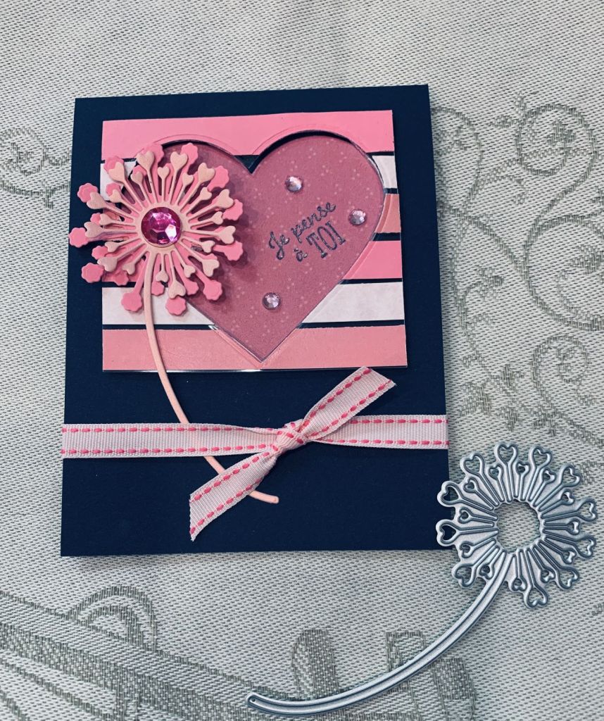
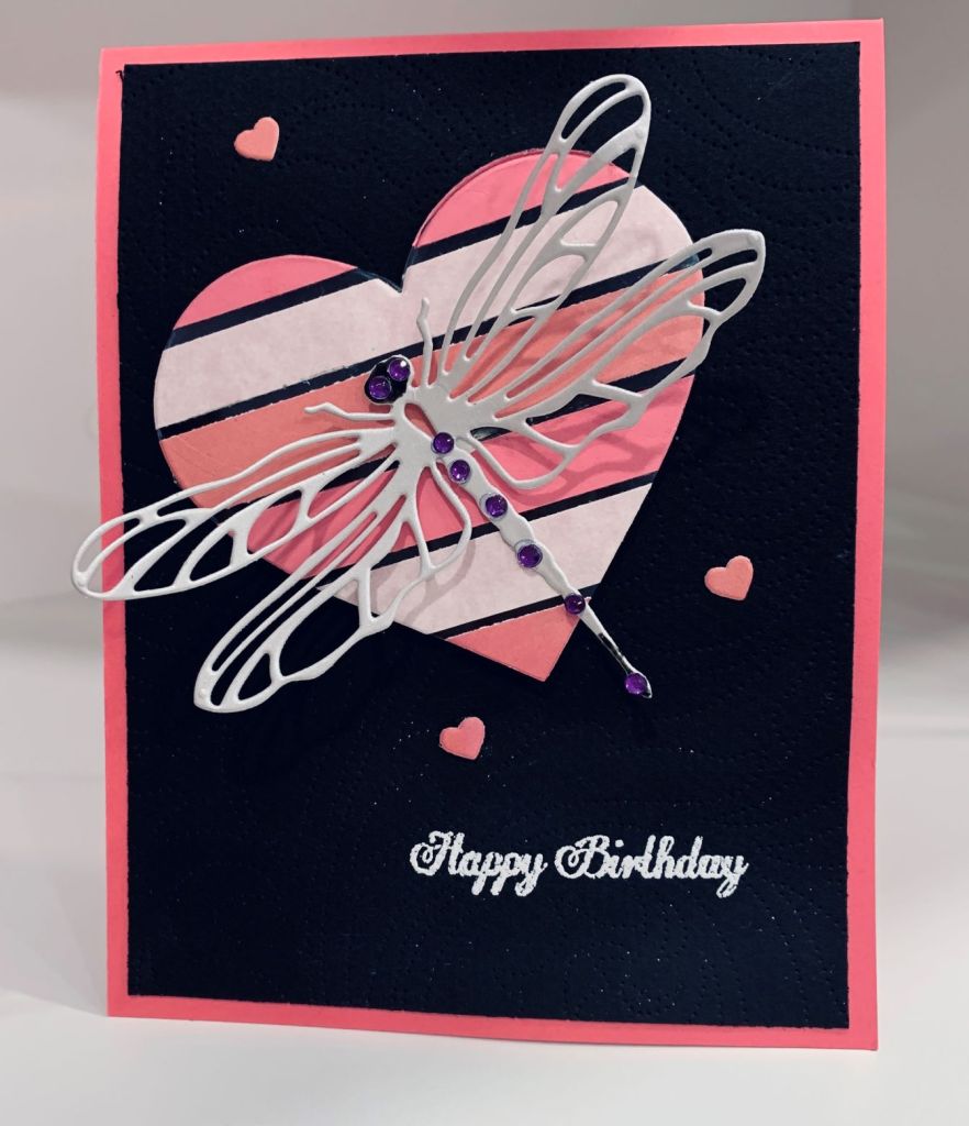
Originally my intention was to have this card work for 2 challenges, but it didn’t turn out that way. To make this I used some silver duct tape over a piece of CS which I then die cut. I trimmed it down to fit and added a black piece behind it. Then I took some striped paper and cut a strip to add as a border top and bottom. I think the die came from MFT, but I’ve temporarily misplaced the label so I’m not 100% certain. The angle of the photo makes it look quite large but it only covers 1/3 of the card front.

CAS and Colours

Challenge #457 – Colours

I find colour challenges really challenging because in many cases I don’t have the right colours. However I think I’ve managed reasonably well with this card. First off, the base is almost an expresso brown and the sentiment is the same colour. Merlot was represented by Aged Mahogany which is pretty close, but the green was really hard. In the end I used Forest Moss and over the top a touch of Evergreen bough which seemed to mix into something resembling the Evening Evergreen. I used an older StampinUp stamp set called Kinda Elclectic for the leaf sprig and butterflies and for the sentiment I used another older SSS set called Smile. To finish the card I spattered some Aged Mahogany.

Thinking of You in French

Color Hues #35- Navy and Pink

After I had finished my first floating technique card I was left with the outline of the heart shape. Instead of discarding this I used it to create this card adding a few other die cuts along the way. The card stock and DSP are from StampinUP. The heart flower is from the new unbranded dies I received yesterday. The heart was another piece left over from the previous post and I added that flat and raised the striped portion around it. I added some ribbon at the bottom which anchors the flower stem and some pink gems to embellish. The sentiment is from a StampinUp set, gifted to me by my girlfriend, and is called Petite Cocchinelle. Its a cute set and will be used because I have several friends who are French. This card is intended for one of them. I have one more pink heart on my desk so most likely I’ll use it soon. I ought to be tidying up, but once again I am creating instead.

Heartfelt Thanks

Shades of PINKChallenge #258 – Photo ChallengeAnything Feminine / for a Lady

The salesperson who has been helping us with all our plumbing fixtures etc, has been really helpful and kind. She did her best to get decent timelines for delivery and followed things up regularly. We decided to do a thank you gift for her and I put together a package of my cards and made this card to go with it. It fits 3 challenges so I’m entering it into those at the same time.

Feminine for Sisterhood of Crafters and must have a flower, pinks in the photo challenge at Inkspirational and pinks for Double D as well and this card fits the bill. The heart flower die is new, unbranded and came from Amazon today. I picked out various pink scraps so I could cut the flowers and make the layer on the card front. Started by cutting the heart and adding some white CS behind it. Stamped the sentiment from Itty Bitty Basics MFT and cut the lighter coloured frame for the heart. After adding foam tape to the layer I added it to the card front. I added a few gems here and there and used the tiny heart stems to embellish. The DSP layer is from StampinUp but the card stock is GKD. I still have a couple of heart shapes to play with and will likely come up with two other cards using those.

Dragonfly Birthday

Challenge #2 2022: Anything Flies using only PINK AND BLACK

When I saw Gayle’s post to this new challenge, I simply couldn’t resist adding a post of my own. So thanks Gayle, I wouldn’t have known about it without you. I also should thank my dear friend Cheryl who shared the floating technique with me and this is my first attempt. I used various pink scraps to create the floating heart following the instructions I had been given. Wouldn’t you know, I can’t find my acetate so instead I used something slightly thicker which came from packaging. It didn’t want to cut through with the die but because the die made enough of an impression it was quite easy to use scissors to get it to release. Although you can’t see it on the photo, I did use a pin point die on the black layer so there is a subtle texture on it. Note to self, always do your heat embossing before using a pin point die. I ended up with white powder spots everywhere and had to edit the photo closely in an editing software to get the spots removed. It doesn’t show as much to the naked eye, but the camera picks up everything whether you want it or not. I used a set of infinity heart dies from Hero Arts to cut all the hearts and used the PaperRose dragonfly you’ve seen me use in the past. I cut the dragonfly from some silver CS and added a few gems for his eyes and tail. The sentiment is from Joy Clair every day sentiments, which I seem to be using exclusively lately. This technique is a fun one and the end result is quite different because it truly looks as if it is floating on the card front. It is one that is useful for colour challenges so I suspect I will try a few more soon.

this is the original photo before I cleaned it up.

Best Wishes

PP578 – A Color Challenge from LeAnne

Based on some card swatches I created with the help of a friend I have gotten as close as I can to the colours for this challenge. The mint macaron green was difficult to get with my inks but I did my best. The photo seems to change the colours slightly, but the teal CS is pretty close to Bermuda Bay in R.L. And the lighter green isn’t bad against the actual paper swatch I had, but looks a bit darker in the photo. C.S. is from Gina K and Heffy Doodle. I used some butterfly stamps from MFT and fussy cut them out before putting the two together. I thought I had dies for this set but the ones I have seem to be for an earlier set as they wouldn’t work here. It wasn’t so complicated to fussy cut thankfully. I also added some Sakura pen glitter to the decorative wings which doesn’t show well here. The sentiment is from Joy Clair and I really like the font of this stamp while the sunshine is from a Concord & 9th set I forgot I had and haven’t inked yet. Am leaving it on my desk to be sure I use more of the included stamps. I added a few gems to the curve of the sun for some bling. Although the card has several layers I still managed to keep it CAS.

Warmth of Christmas

Peace On Earth Challenge #9

It was the pinks and soft greens of the mood board that attracted me and inspired my card. I used my new StampinUp kit Merriest Frames and some DSP to make the card along with a few scraps from my own stash. The hybrid embossing folder along with the intricate die from the set created the pink background piece. I added some glitter washi tape and a white panel to the center and stamped the sentiment on the white piece. Then using some of the accompanying dies I added a few additional leaves and some tiny trees that I had cut from a store bought card I just couldn’t throw away. Using it this way gave me some pretty glittered trees that are delicate. The gold border was a leftover piece that was on my desk and I fitted it around the DSP as a frame. I quite like the end result and still have other ideas for using the rest of the kit.

Minimalist and Colour

Just Add Ink #589…Minimalist! & Global Design Project #329 | Color Challenge

Doing a minimalist type card is certainly challenging and my brain wouldn’t let this one go. Out and about on errands today it came to me that this design might work and that it would also fit into the Global Design as my second try as well. I cut the flower design 3 times once in each colour. The pink looks a bit darker in the photo but is actually a pretty close match to the swatch. I think I’m going to have to add a small light to the shelf which I use for my photos as it seems there is a shadow at times. I decided to carry on with my current scoring trend and did the scoring mostly using the debossed side although the top border is embossed. The scoring tool slipped and rather than scrap the CS I decided to add a small glitter strip to cover up the error and I matched it at the top. Not sure I did the right thing but too late now. I glued the flowers as you can see and added the sentiment at the bottom. It came from my Joy Clair set that I seem to be using a lot lately. I’m not unhappy with this card but wish that I had started over with the scoring. I’m a bit tired from all the errands and my hands are sore which no doubt is why the tool slipped. I just realized I missed the deadline for Just Add Ink – sigh!

Friendship

http://www.global-design-project.com/2022/02/global-design-project-329-color

At the dollar store I found a vellum paper pad that had all sorts of pre stamped and foiled sentiments on it. The piece used here is from this pad. The coloured words are actually pink but look red in the photo and I think perhaps it changed slightly due to the yellow background. The blue striped paper is quite close to misty moonlight but again the photo has altered the tone slightly so it looks darker. All paper is from my stash and the resin heart is another dollar store purchase. I coloured this with Spectrum Noir markers before adding it to the card. Hopefully this works for the challenge even with the slight tone changes in the colours.

Thank You

Make the Cards Challenge #48

The gold frames used here were left over from a Christmas project and the DSP is from the poor cutting I did for earlier projects. Decided to cut up 2 of the triangular shapes and fit them behind the frames. The dark piece in the background has lovely sparkly swirls on it but they don’t show on the photo. It always surprises me how the camera can pick up every error in a project, but doesn’t pick up the shine or the sparkle. The butterfly is from my stash as are the small embellishments. Sentiment is from Joy Clair. Its a much nicer card in R.L. than it looks in this photo.