
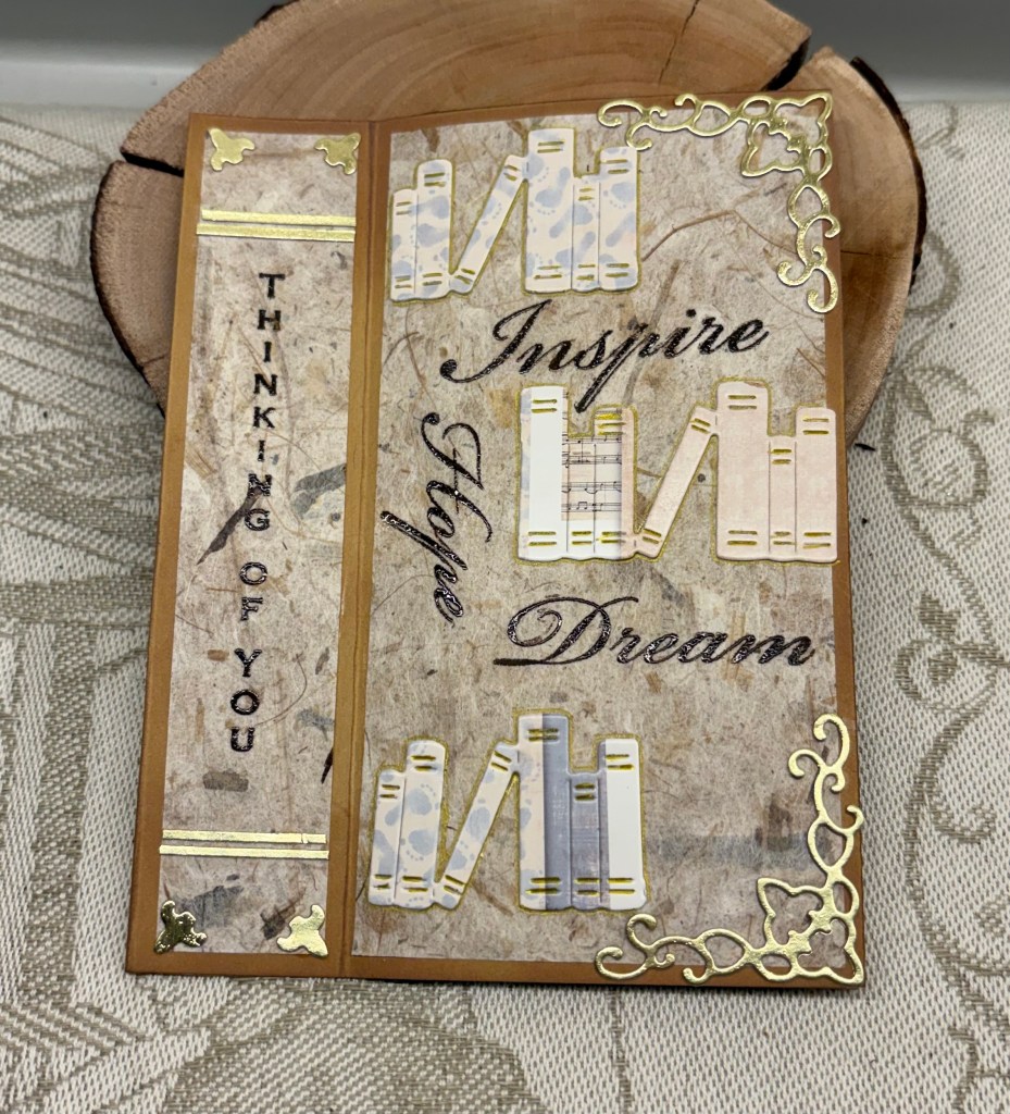
The mood board at Double D has some inspiring images and the challenge gives us choices. As you can see I chose books and a card design that looks like a book. Double D Books/Bookmark and/or Postal/Postage Challenge.
It took me a while to figure out which way I should go with this design. I knew I wanted a portrait orientation so after cutting a normal size card out of some Recollections CS I scored it at 3″ and again at 4.25″. Before gluing this section I went around the edges with a sponge and Vintage photo ink. I wasn’t quite sure about papers but I knew I wanted the book die cut, which I cut from an old hand painted card. I think this die is from Kokorosa, but it could be an unbranded one, I’m not sure. After searching through some paper scraps I came across this mulberry paper that I rather liked so I cut both the spine and the front cover using this. Then I remembered that I had these corner dies (not sure of brand) so I cut two from some Gold and added them as you see, using the fallouts on the spine. I also added some thin gold strips top and bottom. After playing around with the book die cut I found it was going to be more effective if I cut into sections. Once they were glued in place I used a fine gold pen around the edges and on the spines for more detail.
My original intention was to create my own sentiment/book title using the computer, but I also wanted a vertical sentiment on the spine. I used an old GKD set for this with Ground expresso ink and some clear heat embossing. In searching for this set I came across an Inkadoo set that was gifted to me and the word stamps were part of the set. Because I was stamping these as an afterthought I had to play with placement a little, but using the same ink and heat embossing I managed to get what I wanted. Fortunately the paper released the powder easily as I couldn’t prepare it as I normally would have. Having it stick only where I required was a blessing.
I’m someone who is rarely without a book in my hand, when I’m not crafting that is, so this design is right down my alley. I rather like how it turned out and it is just a little different in its design. Thanks for stopping by, you, your time and any comments are always appreciated.


Lovely card! You have so many die cuts that go together nicely. I see the Cherry Lynn corner dies that Gina K sold, now retired since the company closed.
LikeLiked by 1 person
Thanks Lisa. I couldn’t remember where I got those corner dies so I shall make a note so I don’t forget again.
LikeLike
Cool book design. Love the vintage look.
LikeLiked by 1 person
Many thanks.
LikeLike
Great design – love those little book die cuts!
LikeLiked by 1 person
Thanks a lot.
LikeLiked by 1 person
Your choice of using the beautiful mulberry paper is great as a background and this card looks like a lot of work went into it with the gold corners, etc. The “Thinking of You” ties in with the book idea.
LikeLiked by 1 person
Thanks Brenda.
LikeLike
Great book design. I like the book die cuts and gold corners.
LikeLiked by 1 person
Thanks Gerry
LikeLike
Your vintage book design turned out wonderfully. Love your creativity.
LikeLiked by 1 person
Thanks Gayle.
LikeLike
OMG this is PERFECT! Love how it looks like a book jacket! Great vintage feel and love the inspiring words! Fabulous design my friend! Thanks so much for joining in the fun at our Double D challenge! Good Luck and we hope you’ll come back often.
Darlene
<a href=http://www.darscraftycreations.blogspot.com/>DAR’S CRAFTY CREATIONS</a>
Double D Co-Owner
LikeLiked by 1 person
Thanks, I’m happy you like it.
LikeLike
This is very creative design to make this antique card look like a book. Those corner dies are amazing. Wonderful card!
Barbara DT member
LikeLiked by 1 person
Thanks so much
LikeLike
This is a super fun design and I love that mulberry paper. You did a wonderful job designing this.
LikeLiked by 1 person
Thanks.
LikeLike