
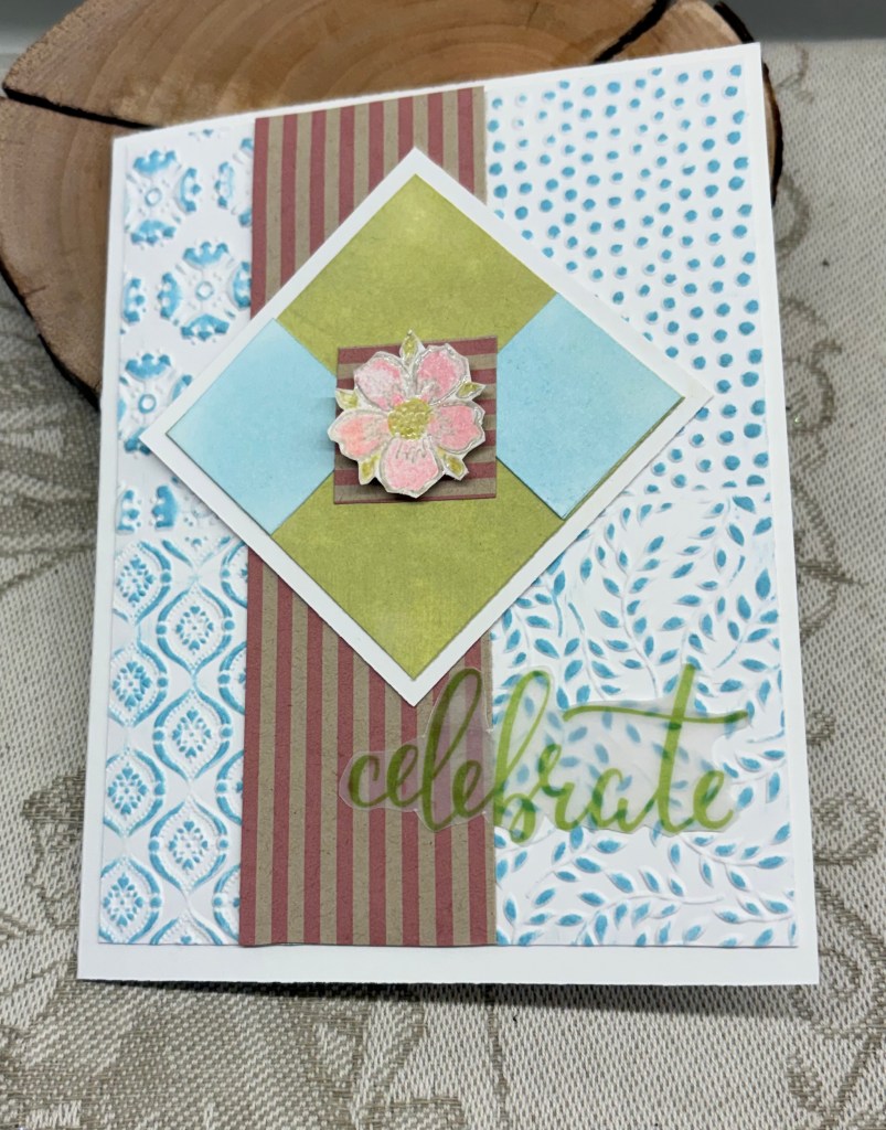
As You See It – Challenge #369 – Soft Spring Colours is a colour challenge this time and I’ve done my best to match them.
I started with the embossed layer using a Catherine Pooler/Sizzix folder. When done I went over the panel with Tumbled Glass ink and cut it down to the size I required. After some searching I located this stiped piece and added it as you see. Then I cut a square white piece and a smaller piece to go on top so that there would be a border showing. This piece I inked green and added them together. While it was drying I inked up another strip of white card in the blue and cut 2 small squares which I then added as you can see. With a small piece of the striped section I added that to join the 2 pieces together. With a stamp set from Inkadinkado I took a small floral, stamped it and heat set then fussy cut it. When that was done I added colour using Prisma pencils and a little bit of the green ink. This was popped up on the center striped square.
My sentiment was from some vellum sentiments I’ve had for a while and this one was beginning to curl so I decided I had better use it before it was too damaged to use at all.
I find it annoying when a photograph seems to change the colours on a card as appears to have happened here. The striped piece is actually a lot lighter in colour than it shows, but it looks much darker now. In fact the entire photo looks darker than it does in real life. I also think I should have used a different folder as this one is quite busy and I’m not sure about the card now. Oh well, it isn’t a disaster, just not quite what I imagined.
Thanks for stopping by, I appreciate that you do and also any comments you may leave for me.


Your card is lovely. I like the square in the diamond configuration over the stripes. It is frustrating when the picture doesn’t show the colors properly, but it’s a very nice design and I’m sure the recipient will enjoy it.
LikeLiked by 1 person
Thanks Judy. You’ve helped me to view it differently and I appreciate the comment.
LikeLike
Lovely card! The camera does things to color that makes them look not what one expects.
LikeLiked by 1 person
Thanks Lisa
LikeLike
Oh, I love this!
LikeLiked by 1 person
Thanks
LikeLike
Johanna, I really like the embossed background, especially the way you’ve highlighted it with the inking of the blue across it. Nice technique. That little checkerboard diamond really emphasises your pretty flower. Thanks for sharing with us at As You See It.
LikeLiked by 1 person
I so appreciate the comments and the challenges you all come up with.
LikeLike
I think it’s really pretty, Johanna! I especially like the fun layout you’ve used, and the way you brought out the embossed patterns with ink! Thanks so much for playing at As You See It!
LikeLiked by 1 person
Thanks a lot
LikeLike
Very pretty. That pretty square diamond is perfect.
LikeLiked by 1 person
Thanks
LikeLike
Pretty design and a great way to incorporate the colors in this challenge.
LikeLiked by 1 person
Many thanks
LikeLike
I share your frustration about cameras autocorrecting colours! I really like your layout- it’s a different way to showcase out challenge colours. Thanks for joining in at As You See It
LikeLiked by 1 person
Thanks a lot.
LikeLiked by 1 person