Hogs and Kisses

Global Design Project #327 | Theme Challenge & SSC275 COOL WINTER LOVE

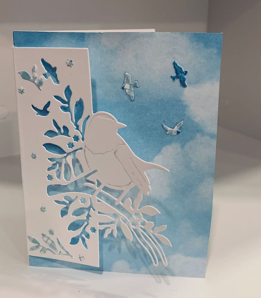
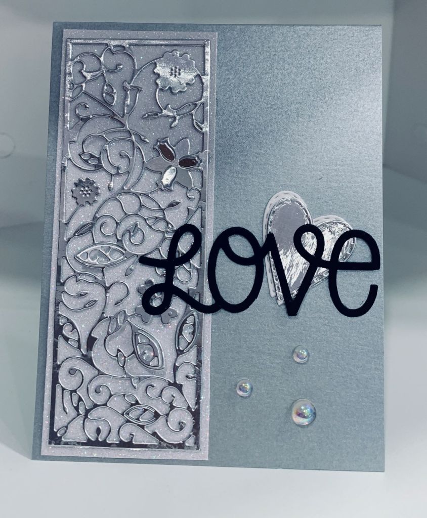
A Valentine or a love theme challenge is pretty easy but a colour challenge is, for me, always a bit more problematic. Matching as close as possible to the colours is quite difficult but I think I’ve managed it. The background die is an unbranded one and I used a failed dry embossing attempt for this. I figured some of the poor embossing would show without it being busy and I was right. I added it to a gray card front to meet one of the grays on the colour swatch. Then I took a silver leftover heart die cut and added a smaller one cut in the gingham on top and tucked it under one of the stripes. Using a Divinity Design cute stamp set I stamped and coloured the little pigs keeping as close as possible to the challenge colours. After die cutting this I glued another piece to the back to give it a bit of dimension and added it as you can see. I had stamped the sentiment from the same set and I went over this with a glitter pen before adding it to the layer. Using a small xoxo stamp from Joy Clair I stamped this in several places for added interest and to increase the Love aspect of the theme challenge. This could have been a really busy card but I managed to keep it fairly simple thankfully. Getting a one card to fit two challenges is a nice bonus.

Tulips

PP575 – A Sketch Challenge from Jaydee

This is my take on the sketch challenge at Paper Players. I used a tulip die I bought in the Netherlands when visiting my sister and it is by Craft Emotions. After die cutting I coloured it with Inktense pencils. Did the flowers first then went over them with a clear Sakura glaze pen so I could do the leaves without worrying that I might mess up the flowers. Added some StampinUp DSP to a gray card front and then added a scrap that was cut into some grass at the join of the 2 pattern pieces. Added the die on top of that leaving a few flower heads loose so they would look more natural. The sentiment is from a Spellbinders set I’ve gotten this year. Decided it didn’t need any embellishments, although I may change my mind before it gets used.

Love is in the Air

Just Us Girls #616 ~ Photo Week

My card uses a small Divinity Design die and stamp set that I got a couple of years ago. I stamped and heat embossed using a Champagne powder from Recollections. The embossed layer is a pre-embossed piece that I trimmed down just enough to give me room for the card front to show as a border. The heart uses a stitched set by Memory Box and a scrap piece of pearlized vellum that I coloured on the back with a pinkish Ohuhu pen. I used the same pens to colour in the image. I kept this card very simple but did add a few Studio Katja gems for embellishment.

The First Sign of Spring

Challenge #266 – Dandy Diagonals

There are times when I can feel truly stupid and making this card became one of them. After I had chosen my image and PP I proceeded to cut the PP. I cut several times and each time the orientation of the diagonal was wrong. Rather than continue to mess up some pretty papers I decided to go with the orientation that resulted and basically turned the sketch to the opposite of the sketch picture. I’m also craving the sign of spring which in my last house was the first snowdrops to appear. I don’t think there are any in this garden, but won’t know for sure until spring really does start to show up. My stamp is from the very first Polymer set I purchased but at that time I didn’t think about knowing the source of the stamp and today have no idea who created it. I can say that it came with a couple of Christmas images as well as an Amaryllis and the Snowdrops. I stamped it in green and clear heat embossed because Snowdrops usually have a slight tinge of green in the petal. I coloured with InkTense pencils and Sakura glaze pens adding a tiny bit of sparkle in one or two places. It was die cut using Hero Arts Infinity dies and a Sissix set of scalloped circles. The sentiment is from Joy Clair and cut with a banner die from an MFT set. I went around the edge of the sentiment with a gold glitter pen and added some Studio Katja gems too. PP is from StampinUp.

Gnome Fun

Peace on Earth Challenge #8

My entry for this challenge was inspired by both the gnomes and plaid as well as the colour red. The stamp used is new and I got it on sale at a local craft store and at the same time purchased the Echo Park Ephemera die cut package. Stamp is by Stampingbella and is called appropriately two gnomes on a log. I coloured it with a mix of Inktense pencils, and Sakura and Ohuhu pens. Firstly though, I stamped it with Versamark and heat embossed in black. I fussy cut it because I forgot to use the stamping buddy and ended up with product in places I didn’t want. Added it to the card using foam tape to give dimension. Used a scrap piece of white sparkle paper which I cut to give the illusion of snow. Added the Plaid sentiment to some white CS and fussy cut that prior to adhering to the card front. I also used the last of the small fallouts from my bird cuts to give the look of snow falling. I really like this fun stamp and may get more from this company down the road.

Slimline in Blues

Blue & White Winter & COLORFUL OPTIONS CHALLENGE BLOG


When I found and used one of the small Asian style dies the other day, another idea come into my head. I had a slimline piece already die cut using an MFT triple stitched circle die and I tested to see whether the small fancy circles would fit into it. As you can see, they fit beautifully so I layered the circle aperture piece onto some pale blue mirrored card and then paper pieced the fancy circles into it. To hide the marks the die left behind I used some white border strips that a good friend cut for me a long time ago. To me this gave the look of some snow. Prior to adding the fancy pieces I also used a tiny strip of white glitter and wove it between the openings of the die cut. Then with all the die cutting I did earlier with the border die that didn’t quite work, I used the fallouts to decorate and embellish. Some I coloured and some I left white. I stamped and heat embossed the sentiment which is also from MFT. I’m quite pleased with how it turned out. Whether it is wintery enough I don’t know but it is certainly cool (as in cold) looking.

Border Die Cut

BLUE & WHITE WINTER

When I first started this card I die cut it using some pale blue gingham paper, but I didn’t like it, although I kept a few of the fallouts available. Then I tried cutting it on a card front and didn’t get the placement right so that too went by the wayside. I will use it, but in a different way than intended. This is my 3rd attempt and I’m still not sure I did it correctly but have made it work nevertheless. I really wanted the card to stand upright but adding more CS made it too thick so instead I used some sky paper from a pad I’ve had forever. I’m not sure it is truly a winter card although my hubby thinks it is, but at least it has the blues and a bird which is the part of the mood board that inspired the card. I used a few of the gingham fallouts as embellishments here and there and I also added some sparkle to both the bird and the fallouts. I’ve also decided to use a sentiment just on the inside of the card as nothing I tried looked right on the front. After thinking about the placement, as I look at the finished card, I think in future placing the die right at the bottom of the card front and preventing the top edge from cutting will work better. Then I’ll use scissors to extend the longer side cuts to the top and bottom of the card so only half of it gets cut away, but still leaves the bird behind. Or I’ll make the card size to fit the die rather than use the usual size. Don’t know why I didn’t think of that before I started.

Never Forget …

SSC274 SPLIT IN TWO

When searching for a die in one of my drawers I came across two small decorative dies that I haven’t used for a long time. Both have a slight oriental feel to them. I can’t remember who the manufacturer is, sorry. Using some papers gifted to me recently I cut some and using a landscape orientation, I added them to the card front with the split as per the sketch. After die cutting the small circle I added it to a slightly larger white circle and then with foam tape added it to the card front. I cut a small heart out of a scrap sparkly piece and I stamped the sentiment onto a black strip and heat embossed it. The sentiment comes from a newish set by MFT called Friends like you. These are all fairly long sentiments and are good for slimline cards. I chose one of the shorter ones for this card. After adding the sentiment I tucked the heart slightly underneath then I added some tiny gems on the printed dots that were part of the pattern on the top piece. This will probably go to a friend who is struggling a bit at the moment. She needs a paper hug as I can’t give her a real one. Even without Covid it would be hard as she lives in another country.

More Silver and White

Color Hues #33-Silver and White

This card uses a background die that I’ve had for a while and believe I purchased as an unbranded die. I decided the last piece of white sparkle CS from LawnFawn would be a good one to use for this. I added it to the card base and in the process dropped it with the glue side down so it messed up the card front. I’ve no idea what is going on with me and glue but I’ve had several mishaps recently. Anyway I cleaned it up and got it glued down after which I realized that the card front was still slightly marked in a few places. Having these stitched hearts already cut meant that I could use them to cover up the marks and still keep the card. The word die is from MFT and I added it at an angle as you can see. A few iridescent gems finished the card. I like that this card, as well as my previous post, can be used as Wedding, Valentine or Anniversary cards so I’ve left the inside blank until I decide.

Silver and White Love

Color Hues #33-Silver and White

Doing a card in silver and white has been on my mind since Monday and I had several ideas on the go. Of course as I began things evolved a whole lot differently than what was in my head and I ended up making two cards that work for the challenge. The other one will follow this post later. I had initially cut out some small stitched hearts in silver and white from a set by Memory box, but they looked a bit blah so I had to think a little bit. Having a roll of silver plumbers tape on my desk I had the bright idea of adding it to some CS and either embossing it or die cutting. I opted for die cutting and used the panel die by Tattered Lace for this. Once it was cut I added it to some white sparkly CS from LawnFawn. (note to self – need to buy more). Using a metallic silver CS I cut two card bases and added this panel to the front of one. Then I added a white heart with a silver one offset on top to the side of the panel. The word die is from MFT and is called Loopy Love and as you can see I used black CS to cut it. The embellishments are Studio Katia iridescent bubbles and I found them when cleaning a drawer and they work perfectly for this card. As you know I am fond of elegant looking cards so I’m happy with this one.