Hints of Gold

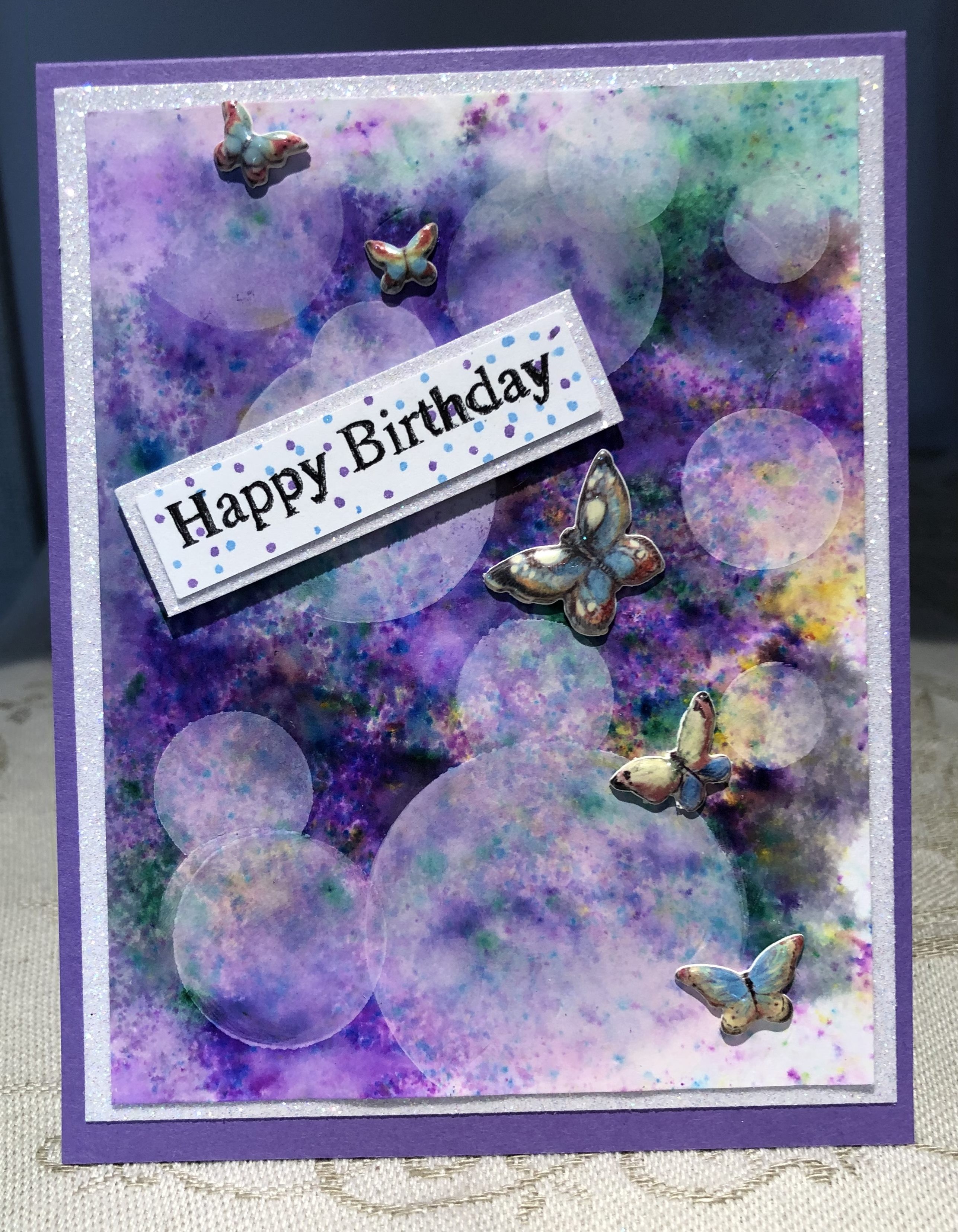
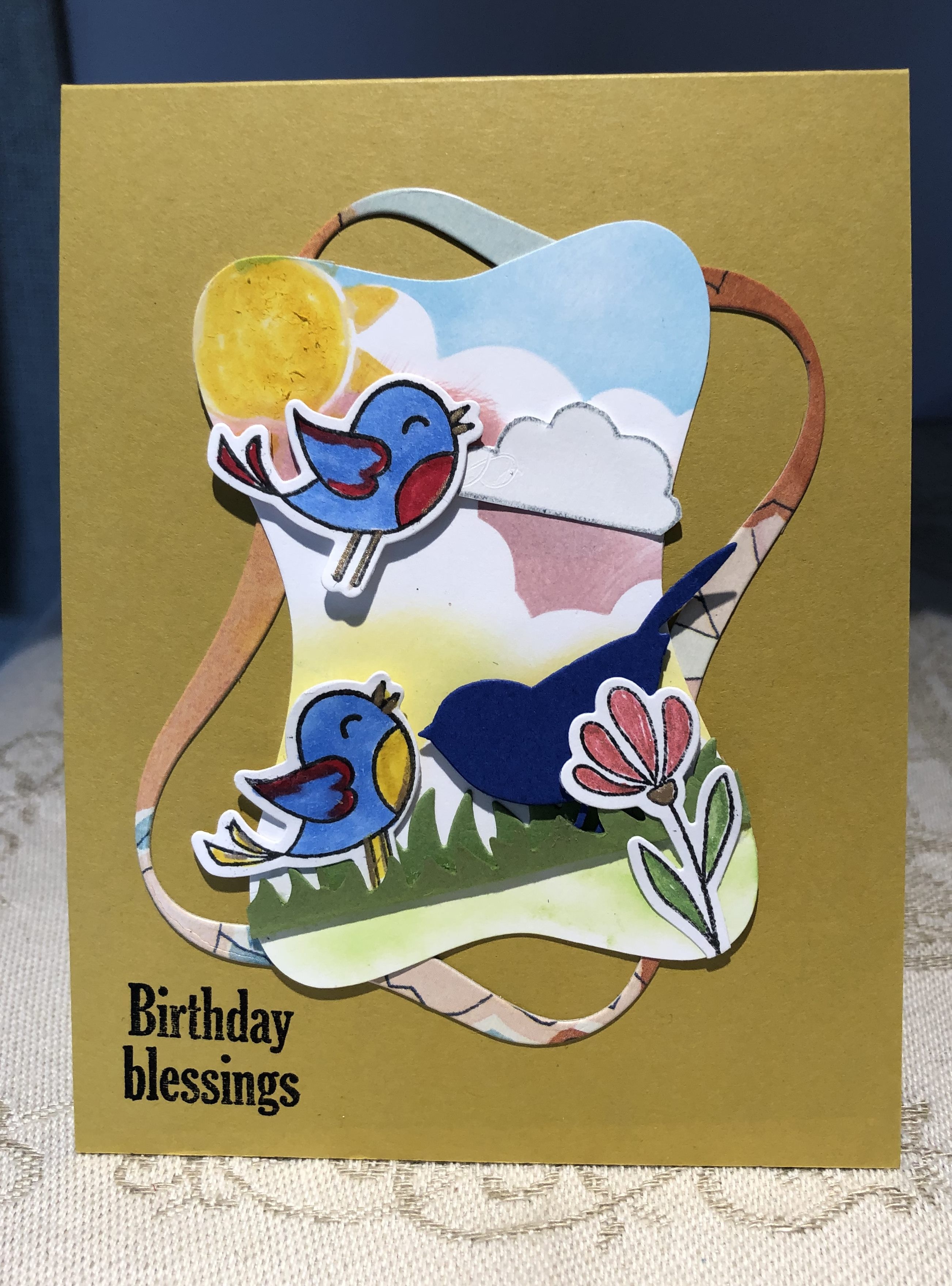
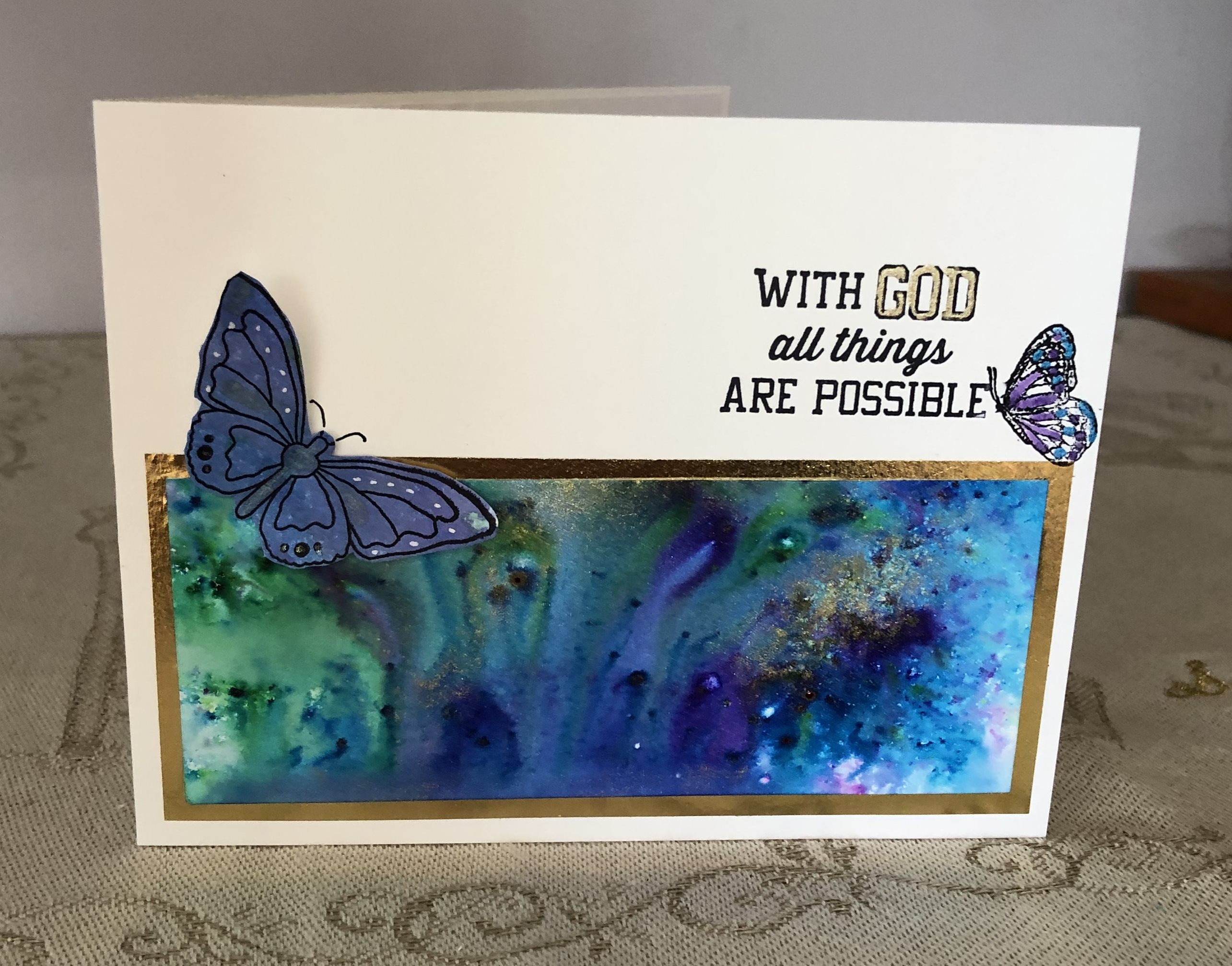
The last play background made using Colour Burst and a bit of gold perfect pearls. I sprinkled the different colours onto CS and added some of the gold here and there. Then I sprayed with water and watched the magic happen. It is such a fun thing to do as each time the effect is so different. I left it to dry and then hubby finally took his photo so I could use it. I decided to enter it into these two challenges.

http://inkspirationalchallenges.blogspot.com/2019/05/challenge-187-designers-choice-gold.html
http://wordartwednesday.blogspot.com/

I cut my panel down into 2 pieces and added this one to a gold washi sheet which I then adhered to the card front. Stamped the sentiment from Our Daily Bread designs and managed to smear the right edge. What to do … my solution was to add the tiny butterfly which then led to the larger 2nd one as it needed some balance. I coloured in one word with a fine gold pen.

Dreamy Daisies

Somehow I forgot to post this on the weekend but I had made it a few days ago continuing on my CAS kick. As it fits into a Paper Player CAS challenge I am entering it there. Using a Gina K. stamp set called Daisy Delight I stamped the daisy image using amalgam ink.

http://thepaperplayers.blogspot.com/

I then used my little metallic paint pots to colour in the flowers. I used a white ink first – let it dry and then added the faint violet to the center of the petals to give some definition. I added three different yellows to the middle of the flowers and some greens to the stems. It has subtle sheen to it and is very pretty in R.L. After adding the sentiment and some tiny pearls I mounted it to the black paper and then to the card base.

Bokeh Colour

My wonderful stampin buddy sent me a new stencil for making circles and I decided to use it to do the bokeh technique which I’ve not done for a while. After first using colour burst powders to create the background and loving the result of that I spent some time drying the piece so I could add the effect.

I found drying it on both sides with my heat tool prevented it from curling too much. As I’m impatient and can’t wait for something overnight, I immediately began adding the circles using white pigment ink. I just love how it turned out but it still needed something. I had the tiny butterflies (puffy ones) sitting around in a tray from ages ago and I added them. I deliberately didn’t want anything to stand out too much from the background so these work just fine to me. I mounted it onto some sparkly background CS and then onto the purple Card front. Added the sentiment strip on an angle and added some dots to the front so it wouldn’t be a stark white. There are speckles in the background so I thought tiny dots would mimic that a little.

Just for Fun

I had one stackers ribbon frame left from yesterdays work so decided to use it somehow. Initially I took a stamp from Lisa Hetricks Today & Always set and added ink to half of it and then another colour to the other half. Did this twice to get the random polka dots. I placed the frame on an angle.

http://www.global-design-project.com/2019/05/global-design-project-189-color.html

I had the flowers already cut out and coloured but I wasn’t happy with them when I made them a few weeks ago so they had been languishing on my desk for a while. I decided they would work here but needed a bit of sprucing up so I used a gold pen and added it in places to get some definition. I popped them up inside the frame and added some random foliage that I cut out with various dies.

Hogs & Kisses

The Sophie Pig stamp set by Beth Silaika has long been a favourite of mine but I haven’t used it in a while. Making some cards for my friends who have grandchildren made me bring it out although any adult would probably enjoy this card too.

After stamping Sophie first I masked her off using liquid masking fluid. I’ve had it for ages and forgotten about it so this is the first time using it. It is so easy and far less time consuming than cutting a mask. Comes off by using an artist eraser. I then stamped the water and the umbrella. Once the mask was removed I coloured in the images using my pencils and gamsol. I added 3 colours of blue to make the look of water but did not use any gamsol as I wanted a rougher look. Once coloured I added some nuvo crystal glace to Sophie’s ears, feet, nose and water. Added the hearts and the sentiment and then mounted onto a red piece and then onto card front. Don’t know why I haven’t done more of these CAS cards as they are quick and easy to do. I’m now on a CAS kick.

Simple Happy

Viewing Pinterest is a very satisfying pastime for me, but one I have to be careful of, as once started I find it hard to stop. Saw a version of this and here is a CASED idea of it.

Its a very simple card and I quite like the simplicity of it. Using a gifted stencil from a stampin buddy, I inked the circles in Twisted Citron. I then stamped the letters and heat embossed in black. Sentiment is from Grand Greetings by Gina K and I cut it in half as I only wanted the birthday part. Got an accidental shadow but I liked it so kept it this way.

Framed Scene

This card is inspired by one of Barbara Campbell’s designs. I loved what she created and was determined to try something myself. My sky is nowhere near as good as hers but thats okay. Mainly created from scraps on my desk as I wanted to use them somehow.

http://daranddiane.blogspot.com/

I used Penny Black’s ribbon stackers die set to cut out the frame and the panel, but I first tried my hand at sponging the background and then cut it out. The dark blue bird is a small die I’ve had for a long time, and the other images are from a set called Happy Spring by Gina K Designs. Used mostly copics to colour the images but the flower was done with glittery gel pens.

Using the negative

Created for the Double D challenge of using frames. I had several scrap pieces on my desk from other projects and decided the negative space from which I had cut flowers was something that could be used. I mounted it on the blue card and then mounted that onto the card front. I added the bling centers but it needed something more so I added blue perfect pearl powder to the flowers as well. It adds some nice shimmer but not showing well in a photo.

http://daranddiane.blogspot.com/

To give slightly more definition I also used a blue copic pen and added some shading to the petals. Stamped the sentiment from a Concord & 9th set in Blueprint Sketch distress ink. Added a bit more bling. On the photo it looks a bit dark but it is much prettier in RL. I hope it qualifies for the frame challenge. To me the negative space created the frame.

Love in a Jar

I’ve had this stamp set for ages and never really tried to use it until now, except for the XO stamp. Of course I managed to get ink where I didn’t want it – managed to get the edge of the block in the ink so it created a few unwanted lines before I realized.

I think I covered them up reasonably well using the XO stamp and some light gray ink. I have absolutely no idea how I acquired this stamp set or who made it but most likely purchased it in Homesense on sale.

Second Cute CAS

Using the same idea as previous card and the Simon Says Birthday celebration set I created another cute card. Well it’s cute to me anyway.

http://modsquadchallenge.com/one-layer-cas/

I’ve used this stamp set a few times and always enjoy colouring it. This time I used some gel pens to colour the hat and of course they are juicy enough to spatter a little. Hence all the little dots. It’s the only way I could think of to disguise an unintentional spot. I did wait until the hat was dry before continuing with the rest as I knew I would smudge the entire thing if I didn’t. Used my pencils but this time I blended with the special pencil that came with the set. Worked great. Added some nuvo crystal glace to the balloons for dimension/shine and a few small stars around the sentiment.