The challenge at Double D this week is all about weddings so I made this card. I used a confetti die from MFT and die cut the word panel. I used Versamark all over it and then heat embossed the rose gold on top. Did this twice to get good coverage. I then die cut a second piece in black paper and paper pieced all the black into the spaces. I could have just placed a black piece behind the entire panel but while tedious to do I think the paper piecing gives a better look. I then took a scrap of sparkle paper, die cut the loops, from same die set, and added them to the bottom of the card front. Used a few gems to give some added punch and considered it finished.

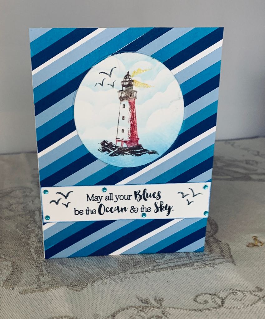
The above slim line card was made using scraps, but in my opinion it wasn’t good enough to enter into a challenge so I set it aside and created the rose gold one. I found the gray cs was a bit dull so I tried to add some shimmer with perfect pearls and dislike the result. It looks better in reality than on the photo because the camera has picked up all the smudges and smears which are not so apparent in R.L. Birds are done with sparkle cs and really sparkle in R.L.